Sunday, February 28, 2010

Interior Design Spotlight - La Estancia Gaucha

One of my family's favorite restaurants in town has just recently opened a new location. I hadn't had the chance to go until this weekend though I'd heard it was a beautiful place, with an original ceiling. I really never pictured how amazing it was until I got there.

You know me. I had to share. ;)


I'm not sure if the picture does justice. It's really something. It's wavy and it seems to move as you move.


Here's a close-up.

Did you notice it even seems to move as you scroll up and down with your mouse?
How cool is that?

This is what you see if you look straight up:
This wooden structure was designed by Oseo Creativo.

Obviously the ceiling is the main attraction here, but I should let you know this is the best Argentinean Restaurant in town according to many. And the rest of the interior design is just as lovely.

The bar.

Another angle from the restaurant.

The lovely terrace.

The new Estancia Gaucha is located in a gorgeous new building, Punto Sao Paulo, and it quickly became the hot spot. No wonder why.

Hope you enjoyed the tour. I'd love to know what you think.
´
{All images mine, except for the last three via estancia gaucha}

Saturday, February 27, 2010

Green Products - Skoy

I'm always on the search of green products and solutions, so when I found out about Skoy I was excited.


What is Skoy, you say?  It's a multi-purpose cloth that is perfect for cleaning hard surfaces. It's absorbent, and best of all re-usable for several months. Excellent time to ditch those paper towels, I say!

And I know some of you might already use a cloth instead of paper towels in your household chores (like me). What makes this one better? Opposite to microfiber cloths, Skoy is made from natural fibers, so it's 100 percent biodegradable. (LOVE those words!).

Thursday, February 25, 2010

Great (and Easy) Ideas for Your Living Room

1. Use mirrors to double your space.

This works wonders for your space, especially if you choose an original mirror, such as this one. Swoon.

2. Instead of a coffee table, use a cluster of tables.


Using a couple (or several) side tables, instead of the large coffee table gives you a chance to move the furniture according to your needs, while it makes the living room look more modern.

3. Incorporate plants.

Who says plants go outside? Try going with ferns or topiaries to add a sparkle of green to your living room. Real plants are great elements in decor.

4. Frame your walls.

A popular move for walls in your living room (or any other room) is to hang up many frames instead of a large one. It's a perfect chance to display anything, not just pictures. Try using paper shapes and tape to avoid mistakes when nailing.

5. Add interest with large scale images or phrases.

Nowadays it's easy to have different looks on walls with vinyl stickers for the purpose. Best thing is, once you get tired, you just peel it off and you're ready for another makeover!

6. Shelves on walls.

The living room is the perfect place to read a book, so why not use a wall to install shelves? This is probably not as easy as the other ideas, but it gives you room to keep books, papers and decor elements, and perhaps even the chance to settle your home office in a tiny nook. And they look so pretty.


7. Slipcover your sofas and couches.
It's trendy, casual, and kid-friendly!!!!


Do you have ideas for living rooms, or any other room in the house?
Let's hear it!

images:
1, 5: via decorpad
7: via nest

Sharing with:
 Melissa at The Inspired Room

Monday, February 22, 2010

2010 color of the year


Talk about coincidences.

The other day I was talking about turquoise being the color for 2010. Now, Pantone names it 2010 color of the year. Now we know for sure.

Here are some interesting things said:

Combining the serene qualities of blue and the invigorating aspects of green, Turquoise inspires thoughts of soothing, tropical waters and a comforting escape from the everyday troubles of the world, while at the same time restoring our sense of wellbeing.

Turquoise is a color that most people respond to positively. It is universally flattering, has appeal for men and women, and translates easily to fashion and interiors. With both warm and cool undertones, Turquoise pairs nicely with any other color in the spectrum. Turquoise adds a splash of excitement to neutrals and browns, complements reds and pinks, creates a classic maritime look with deep blues, livens up all other greens, and is especially trend-setting with yellow-greens.


Need to say more? I think not!

Saturday, February 20, 2010

Beveled Mirrors

I love the use of mirrors in decorating. I like the way they open up the space and reflect light making the room feel bigger, and warmer.

However, there are some mirrors that go beyond that.

Take a look at these beveled mirrors.


I would love to recreate the look of the third picture in my Master B or living room.

Which is your favorite?

Wednesday, February 17, 2010

Affordable and Amazing Bedding Designs

I'm so loving  DwellStudio's new line of bedding.


Best of all? No quilt or conforter over $80. That's great news.

Wanna know what's even better? These are all available at Target.

P.S.
Sharing with Melissa at The Inspired Room
(By the way, Mel, thanks for hosting!)

Tuesday, February 16, 2010

White Inspiration

Somewhere at an Italian Restaurant.

Delicious dinner.

Delightful place.

Monday, February 15, 2010

How to Make Rice Krispies Treats

This was a fun weekend for us. We had a blast celebrating Valentine's Day together as well as with our families and friends. Can't get any better than that.

At least that's what I thought yesterday night, when the day was practically over. That's when my daughter asked me to make something together for her classmates and teachers for Valentine's Day. At 8:00 p.m. this was a tough challenge. I was almost ready to pass the opportunity when I remembered a great and easy recipe both of us had made together a few years back.

Have you tried these?

I bet you have. And If you're anything like me, I bet you like them, too. Kids LOVE Rice Krispies Treats, and who doesn't? They make the perfect treat for any occasion. Seriously, any: birthday parties, Valentine's, Mother's Day, Halloween, Christmas... you name it.

These delights are very easy to do and take as much as 30 minutes in total, so I thought I HAD to share:

Rice Krispies and
Marshmallow Treats


You'll need:

3 tablespoons butter (or margarine)
1 package (10 oz) marshmallows
6 cups of Rice Krispies
food coloring (optional)

How-to:

Melt butter over low heat.

Now, add your marshmallows and stir. They will start melting, so you need to keep stirring until they melt completely. This is the moment to add food coloring if you want to make colored treats. (If you do, you should only use white marshmallows). We used 4 drops of red coloring.

Add the Rice Krispies litte by little, until they are evenly covered.
Remove from heat.

Butter your baking sheet or surface where you're spreading the mixture (you can also use cooking spray).

Use a buttered spatula to press the mixture evenly thoughout the pan or surface.

The mixture is very sticky and it will cool quickly, so you might want to work it with your hands. In this case, butter your hands to prevent making a huge mess!

Cut with cookie cutters or cut into squares with knife for the traditional look.
You can even use lollipop sticks and cover one end with the mixture into a small ball to make lollipop treats.


Aren't they sweet?

Hope you all had a great Valentine's Day!

Sharing with:

Making the World Cuter
DIY Day at A Soft Place to Land
Toot Your Horn Tuesday at Silly Little Sparrow
Victory of the Week at Design-aholic

Thursday, February 11, 2010

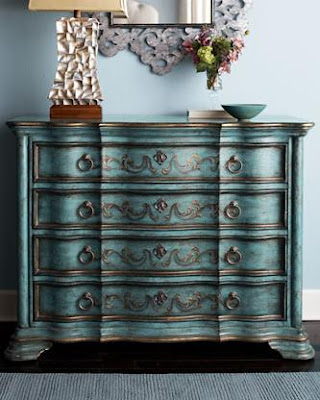
Trends: Turquoise Accents

Have you noticed that turquoise is the color for 2010?


From gorgeous pieces of furniture to glam accents for your table, it's all about turquoise, baby.

Which is your favorite?

images:
1,2: horchow
5: zgallerie

Sharing with
Melissa at The Inspired Room

Tuesday, February 9, 2010

Designer Spotlight - John Saladino

I ran accross some photos from a Soho apartment in NYC, designed by John Saladino and I just had to share with you. Tremendous amounts of eye candy and inspiration!


The inspiration for this apartment was the movie Girl with a Pearl Earring, depicting the life of Vermeer, the great Dutch painter. I love the color palette that Saladino chose to use, especially the light brown backgrounds found on the floors and walls.

Paladino uses drapes to separate two different areas; the living room and the kitchen. This is a very easy way to create two rooms in one, while leaving the feeling of openness.

As you see, the color palette is uniform throughout the house. I love the look of silver against light brown.

The breakfast nook was created in the same space as the living room. Saladino uses smaller furniture to separate it from the rest of the room.

I haven't seen the idea of a sofa at the dining room before, but I think it looks lovely. I like that it gives a casual feeling to the room, almost like another living room.

This is my favorite space. I'll definitely use this as inspiration! The stairwell is simply amazing. Again, the use of earthlike tones gives a sense of unity to the apartment.

This is the second floor landing, which I find totally beautiful. The star sitting on the bench is completely inspiring. Saladino uses the mirror to double the space. Again, another excellent idea to apply in any space.

I like the rock containers, they're so original!

In the bathroom, some paintings by Verneer.

Can you tell where the mirror is in this room? A clever way to use it was placing it opposite to the shutters, creating the feeling of a larger corridor. I love this clean and classic look.

What inspirational ideas can you come up with?

{all images via Veranda}

LinkWithin